I'm back with another late night post tonight. After a LONG day of work and the family all in bed, I had a little time to sit down and knock this one out. Someone mentioned to me a while back that they don't see me draw very many women. I think that's probably just because I've never been very good at it. But I've tried to stick with a LADIES WEEK type of theme for the last few days.
Tonight's subject is none other than the lovely ALANA, one of the focal characters of Vaughan & Staples SAGA. I know I've mentioned it before, but seriously, everyone needs to be reading this book. I'm absolutely in love with it !
ALANA
6x9, brush pens on bristol
20 minutes
Showing posts with label comic art. Show all posts
Tuesday, June 5, 2012
Sunday, June 3, 2012
Daily Sketch 011- ARIEL, from GREEN WAKE
Hello again ! First off, I just wanted to say thanks to everyone who has given positive feedback on the daily sketches. I've really been enjoying doing them, and feel like I'm definitely growing as an artist by trying some new and different things.
Speaking of new things, I certainly did something a little different today. Today's subject is ARIEL, from Kurtis J Wiebe and Riley Rossmo's haunting and heartbreaking Image Comics series, GREEN WAKE. I decided to experiment with some color again. I used a slightly different watercolor technique, creating washes with different colored Bombay India inks. I'm really pleased with the way it turned out and I think it definitely conveys the type of mood and tone I was looking for. I really would like to try some proper watercolors eventually, so once i get a nice st of paints we'll see how that goes. Thanks for stopping by !
ARIEL
6x9, brush pen and watercolor on bristol
30 minutes
Speaking of new things, I certainly did something a little different today. Today's subject is ARIEL, from Kurtis J Wiebe and Riley Rossmo's haunting and heartbreaking Image Comics series, GREEN WAKE. I decided to experiment with some color again. I used a slightly different watercolor technique, creating washes with different colored Bombay India inks. I'm really pleased with the way it turned out and I think it definitely conveys the type of mood and tone I was looking for. I really would like to try some proper watercolors eventually, so once i get a nice st of paints we'll see how that goes. Thanks for stopping by !
ARIEL
6x9, brush pen and watercolor on bristol
30 minutes
Wednesday, February 29, 2012
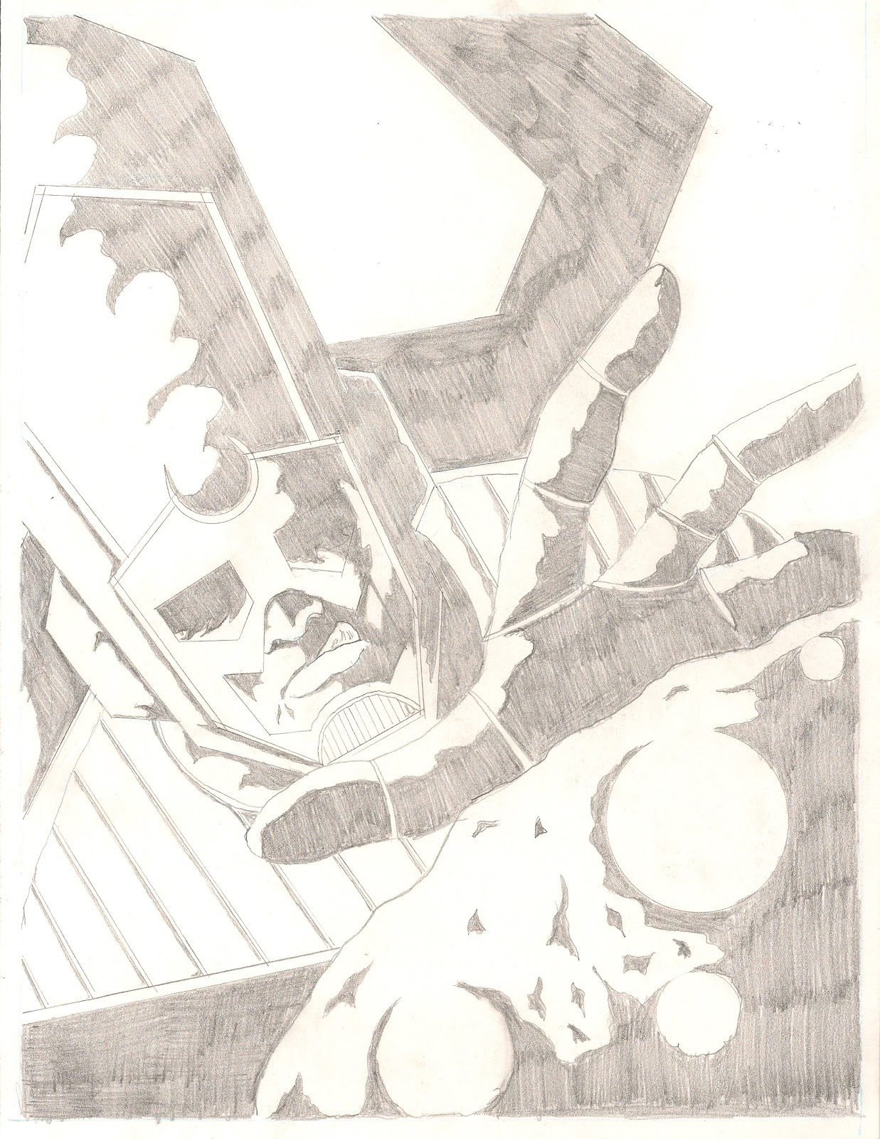
GALACTUS, DEVOURER OF WORLDS
Hey everyone ! Here's a piece I did for week 8 of the Challengers ASSEMBLE! sketch blog. The theme was obviously Galactus, and I'm really pleased with how this came out. I've include a scan of my original pencil work here as well because I really am happy with my work on it. Make sure you head on over to the blog and check out all the other great artists who contributed this week.
Thanks for reading !
Thursday, February 2, 2012
Challengers ASSEMBLE ! Week 4 - Panel Re-Creation - Process
So last weeks theme on the sketch blog was panel recreation. We had to choose a panel (or panels, in my case) from a comic we read the previous week and re-create/reinterpret it. I happened to be reading NORTHLANDERS Vol 1 - Sven the Returned, by one of my favorite writers, Brian Wood, and amazing artist Davide Gianfelice. The particular page I chose was from issue #6, page 5. I decided to this blog post to show my process from beginning to end of the piece. Here goes :
PREPARATION
I start by by getting my workspace (aka coffee table) and materials together. I have my source material, a sheet of 8.5x11 Strathmore smooth bristol, my pen/pencil case loaded with numerous weapons, a small plastic t-square, circle templates, and of course way too much caffeine.
The first thing I do on the board is take my t-square and rule out my working area with a 2mm pencil. For this particular piece I'm doing basically a comic page, so at this point I also rule out my panel borders. Since I'm doing some hand lettering as well, I also use my circle templates to place word balloons so I know where I have to work around them.
PENCILS
After everything is ruled out and set to go, I go directly into penciling. I typically use 2 pencils for this process, .7mm and .4mm Pentel Graphlet drafting pencils. I really like the grip and the sturdy feel of these pencils, and they're small enough to give me good, tight lines. For a lot of the pieces I've been doing recently, I basically do a pretty rough sketch and then add most of the detail in the inking process. For this piece however, there is quite a bit of detail involved, so I decided to do tighter pencils to help avoid mistakes when inking. Here's a few detailed shots of the penciling process :
And here's how the full page looks after the penciling is complete :
LETTERING
One thing is for sure, lettering is not my thing. My handwriting is not the worst in the world, but it's pretty dreadful. Anyway, I just used a small ruler to measure everything out, and then the .4mm pencil the write in the words. The only thing I'm unhappy with in this piece is the lettering.
INKING
The first thing I do in the inking process is ink the page & panels borders, and also the word balloons and dialog boxes. For this I used a .5mm Copic Multiliner SP. I love these pens, and I'll use them a lot for fine and technical lines in a lot of my work. I also used these to ink the lettering on the page.
After that, it's in to inking the body of the piece. In this case, I worked from panel to panel, left to right & top to bottom. My favorite tool for inking is the Pentel Pocket Brush Pen. I love this thing. It makes great lines, the brush tip never loses shape, and best of all it's refillable ! I also use various sizes of Kuretake disposbale brush pens when i want to work in some smaller detail. All of these are filled with permanent, archival quality india ink.
I usually start each panel by outlining all the black areas that need to be filled in :
And then add some detail :
And then fill in all my black shaded areas :
When all the ink is on the page, I go over the entire page with a white rubber eraser to eliminate all traces of the penciling that I worked so freaking hard on :( Then, at last we have our :
FINAL PIECE
I'm really happy with the way this turned out. I really enjoy this series, and I wanted to make sure I did Gianfelice's art justice. In my eyes, I was able to pull that off.
Make sure you head over to Challengers ASSEMBLE! to check out all the great artwork that's been posted there so far. I've really enjoyed doing this for the first month so far. It's helping me be more creative with my art, and I've been able to draw things that I wouldn't necessarily do on my own. This weeks theme is Image Comics, and the new art will be posted on Friday. For my piece I've chosen my favorite Image series of all time, which is...... a surprise ! Well, until tomorrow anyway.
I hoped you enjoyed this look into my process. If you have any questions, comments, critiques or suggestions please feel free to leave them in the comments section below this post,
Thanks for reading !
PREPARATION
I start by by getting my workspace (aka coffee table) and materials together. I have my source material, a sheet of 8.5x11 Strathmore smooth bristol, my pen/pencil case loaded with numerous weapons, a small plastic t-square, circle templates, and of course way too much caffeine.
The first thing I do on the board is take my t-square and rule out my working area with a 2mm pencil. For this particular piece I'm doing basically a comic page, so at this point I also rule out my panel borders. Since I'm doing some hand lettering as well, I also use my circle templates to place word balloons so I know where I have to work around them.
PENCILS
After everything is ruled out and set to go, I go directly into penciling. I typically use 2 pencils for this process, .7mm and .4mm Pentel Graphlet drafting pencils. I really like the grip and the sturdy feel of these pencils, and they're small enough to give me good, tight lines. For a lot of the pieces I've been doing recently, I basically do a pretty rough sketch and then add most of the detail in the inking process. For this piece however, there is quite a bit of detail involved, so I decided to do tighter pencils to help avoid mistakes when inking. Here's a few detailed shots of the penciling process :
And here's how the full page looks after the penciling is complete :
LETTERING
One thing is for sure, lettering is not my thing. My handwriting is not the worst in the world, but it's pretty dreadful. Anyway, I just used a small ruler to measure everything out, and then the .4mm pencil the write in the words. The only thing I'm unhappy with in this piece is the lettering.
INKING
The first thing I do in the inking process is ink the page & panels borders, and also the word balloons and dialog boxes. For this I used a .5mm Copic Multiliner SP. I love these pens, and I'll use them a lot for fine and technical lines in a lot of my work. I also used these to ink the lettering on the page.
After that, it's in to inking the body of the piece. In this case, I worked from panel to panel, left to right & top to bottom. My favorite tool for inking is the Pentel Pocket Brush Pen. I love this thing. It makes great lines, the brush tip never loses shape, and best of all it's refillable ! I also use various sizes of Kuretake disposbale brush pens when i want to work in some smaller detail. All of these are filled with permanent, archival quality india ink.
I usually start each panel by outlining all the black areas that need to be filled in :
And then add some detail :
And then fill in all my black shaded areas :
When all the ink is on the page, I go over the entire page with a white rubber eraser to eliminate all traces of the penciling that I worked so freaking hard on :( Then, at last we have our :
FINAL PIECE
I'm really happy with the way this turned out. I really enjoy this series, and I wanted to make sure I did Gianfelice's art justice. In my eyes, I was able to pull that off.
Make sure you head over to Challengers ASSEMBLE! to check out all the great artwork that's been posted there so far. I've really enjoyed doing this for the first month so far. It's helping me be more creative with my art, and I've been able to draw things that I wouldn't necessarily do on my own. This weeks theme is Image Comics, and the new art will be posted on Friday. For my piece I've chosen my favorite Image series of all time, which is...... a surprise ! Well, until tomorrow anyway.
I hoped you enjoyed this look into my process. If you have any questions, comments, critiques or suggestions please feel free to leave them in the comments section below this post,
Thanks for reading !
Thursday, January 19, 2012
Challengers ASSEMBLE ! - Week 2 - Captain America
Here's my piece for the second week of Challengers ASSEMBLE! . The theme for the week was Captain America and everything related, so I chose Ultimate Cap. It's 8.5x11 ink on Strathmore smooth bristol. Thanks for checking it out !
Wednesday, December 7, 2011
THE KING III - final
Hello again,
You might have noticed I played a round with the titles of a couple posts here. The last post I did was originally THE KING III, but since it wasn't technically a finished piece (and i wasn't happy with it anyway), I decided to just call it something else.
Anyhow, here is the "THE KING III". I did a rough of this in my sketchbook the other day, and was really pleased with the look of it. So I decided to do a full piece for it. It's a little different look for my guy here. I've been toying with some story ideas for this fella for a while, and the more I draw him, the more the story seems to evolve.
I'm actually thinking about doing some art prints of some of these pieces. If that's something anyone would be interested in, please let me know in the comment section below this post so I can get a gauge on the level of interest.
As always, thanks for reading !
THE KING III
9x12, brush & ink on Strathmore smooth bristol
You might have noticed I played a round with the titles of a couple posts here. The last post I did was originally THE KING III, but since it wasn't technically a finished piece (and i wasn't happy with it anyway), I decided to just call it something else.
Anyhow, here is the "THE KING III". I did a rough of this in my sketchbook the other day, and was really pleased with the look of it. So I decided to do a full piece for it. It's a little different look for my guy here. I've been toying with some story ideas for this fella for a while, and the more I draw him, the more the story seems to evolve.
I'm actually thinking about doing some art prints of some of these pieces. If that's something anyone would be interested in, please let me know in the comment section below this post so I can get a gauge on the level of interest.
As always, thanks for reading !
THE KING III
9x12, brush & ink on Strathmore smooth bristol
Thursday, November 10, 2011
WORMWOOD : GENTLEMAN CORPSE
I've been a big fan of Ben Templesmith for quite some time. If you aren't familiar with him, he's a comic creator from Australia who has worked on projects such as 30 Days of Night with Steve Niles, FELL with Warren Ellis and several of his own books from IDW Publishing.
I finally got around to reading the first volume of one his IDW books, WORMWOOD : GENTLEMAN CORPSE. This is by far my favorite work of his that I've read. You can tell he really puts a lot of effort and heart into his work in general, but this series especially. The thing I like the most about Templesmith is that his art is completely unique. He isn't afraid to break the rules of traditional comic art, and because of that it really stands out. The colors and textures that he uses are so different than anything else out there.
I liked the book so much that I decided to do a piece featuring the main character of the story, Wormwood. When I was done, I decided I wanted to try doing something with another character from the story, Medusa. I bought some red India Ink a while back, and I thought this would be a good opportunity to put it to use.
If you're interested in checking out some of Ben's work, Amazon has a great selection of his books at great prices here !
I hope to be posting more stuff soon. As always, thanks for reading !
WORMWOOD : GENTLEMAN CORPSE
9x12, Pentel Pocket Brush Pen on Strathmore smooth Bristol
MEDUSA
9x12, Pentel Pocket Brush Pen, brush & Bombay red India Ink on Strathmore smooth Bristol
Subscribe to:
Posts (Atom)